Using the colours I created beforehand, I then started making collages out of them in Photoshop. This was just purely being loose and free with what I was creating. I really tried not to think too much about a paticular composition. I very much just threw things together really.
In todays lecture, the subject of interest today was saturation. Saturation describes the purity and intensity of a colour. The first part of the lecture was to make a colour palette from the pure hue down to the grey of the saturation. In my case I decided to go with two complimentary colours, red and green.
Before I was able to get to know the term in colour theory called value. I had originally associated it with only black and white, that was until I discovered the art of Feng Zhu. Watching his videos via http://www.youtube.com/user/FZDSCHOOL?feature=watch I found his teaching very helpful in understanding the use of values and also about general compostion that is, in my case, making the foreground darker and any objects in the background lighter or faint.
In the blue coloured piece by Craig Mullins. I much like the choice of colour here in the blue, the blue shade (dark blue) is made even more striking by its use of a slightly darker blue to show the many caves situated within these rocks, the tinted blue in the backdrop for me adds to the interest of whats likely happening in the backdrop.
The image here from Makoto Shinkai's 5 centimetres per second shows good uses of colour value to present the desired mood to us, in this case a winter setting with snowfall. Almost all but for the building windows and in some small part the characters themselves are covered in a blue colour with light blue tints and dark blue shadows.
In the two drawings above, both my own and previously used in the Hues lecture blog, also shows some value, in terms of the various blue colours there, although in the buildings themselves show a darker shade of blue. The objects situated in the backdrop take on a lighter tint of blue as they get further away.
In todays lecture. I was learning about Value. Also known as tones, values refer to brightness and darkness of a colour. i.e. Blue, dark blue, light blue. In red however, it is the only colour to have its darker and lighter shades with different names, pink and maroon.
The two images above are from the lecture exercise where the objective was first, to place the values in order i.e. from tint to shade or vice versa. The exercise below that one involved me having to place my colours but with the tints being more dominant than the shadows. The image below is the vice versa of the tint exercise. This one is now the shadows being more dominant.
When I created my piece. I originally wanted to choose blue and orange. I think personally they are my favorite complimentary colour pair.
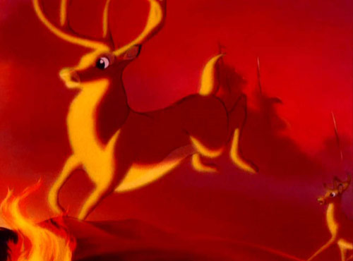
As the first lecture I was undergoing last Tuesday was about hues, warm, cool, harmonious and complimentary colours. I think it only fitting to do some research into various uses of these principles. These scenes below from Bambi to the Lion King greatly emphasise the uses of hues to capture the drama and intensity of what Disney is trying to emphasise to us. The first four use warm, well, I would define them as hot colours, the first and forth image seem to me to work in harmony, the first image too also has some red purple there which I noticed.
In scenes like the first one below from Bambi. This takes a different outlook from the above scenes where the colours depict intensity and drama. When I watched this scene for the first time, I found to me the colours gave a feeling of emptiness as there is nothing else in the scene but a faint tree and the two characters. Alongside that, the only intensity I can get from it would be that sense of unpredictability because the colours make the scene look empty and barren, there is that small feeling of "whats going to happen next?" To me these colours make a scene look unpredictable and curious to find out more.
In this scene from the Lion King, of course the death of Mufasa. From my analysis, the colour scheme on him is just clear enough to emphasise his status in the scene as our first subject of interest, the focal point. As it has been made clear that he is dead, the next subject would be Simba, the colours used on him are also bright enough to see. Everything in the background is deliberately tinted not only as a major rule to tint out all far away objects but to draw our attention to what is happening in the foreground, in front of us.
This drawing here which I had done as a test of general mood, is a night scene. When I was doing this drawing I thought quite thoroughly about what colours I wanted (warm/cool). In this case, as it was a night scene, I wanted to use cool colours for the general external objects (fence, grass, buildings) with the only warm colours used for the windows of the buildings.
With these two drawings here, drawn practically a month apart. The thought for which colours to use in this was for me more deeply considered than the first drawing shown at the start. I chose to use cool colours again in particularly the use of blue colours to depict the cold nature of the second drawing. There is also the complimentary orange colour for the electrical timetable alongside the contrasting red for the Underground symbol.
In this photograph taken from my holiday last year. In my view, there are cooler colours present in this photo due to the photos cold nature. Although, as there is some dim sunlight in the photo, it suggests despite the
general coldness, there are some vague warm colours in the slightly faint backdrop.
(Accessed 28th Nov 2011).
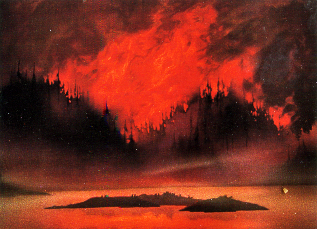
Between 3:54 and 4:12 of this part of the Akira movie I much admired the colours used in that particular scene showcasing the characters environment. As a bustling Neo Tokyo environment set out in the year I think its 2019 I much like the use of warm oranges, yellows, reds and some red purples alongside some calmer colours too.
Right, now then. In my first post here, I explained briefly the first exercise I had to do for colour theory lecture, the second part of the lecture involved taking the colours I painted on the A2 paper and trying to create a collage out of them in three different ways.
They proceed as follows:
a) using 5 contrasting hues
b) using 3 - 4 harmonious (neighbouring) hues
c) using 3 harmonious hues + 1 complementary hue or using 5
hues, some 'warm' and some 'cool'.
So, in using photoshop to do the work. I created the following. One for each of the three exercises.
5 contrasting hues.
5 Contrasting hues.
The aim of the three exercises was to learn about hues and the manner of how contrasting, harmonious and complimentary hues worked in the colour spectrum.
The 3 harmonious hues and the one complimentary hue.
Although the instruction says 3 - 4 harmonious colours. I inadvertently ended up adding an extra one. Also, I wasn't particularly sure about how they had to be organised, so I just grabbed the colours I created from the A2 paper and assembled them to form some kind of abstract design.
Harmonious Hues II.
Harmonious Hues III.
And that in turn concludes the exercise section for hues.
Right, another new blog to add to my other 2 existing blogs. OK, moving on from that. Just last Tuesday I started work on colour theory classes. The first lectured started last Tuesday and was very much a revisit to creating the colour wheel and the primary, secondary and tertiary colours.
Basically. In this image here, the task was to create 12 shapes demonstrating the primary, secondary and tertiary colours. I originally created them on A2 sized paper but naturally, trying to scan it was horrible so I cut up the shapes in order to fit them in the scanner.


.png)


