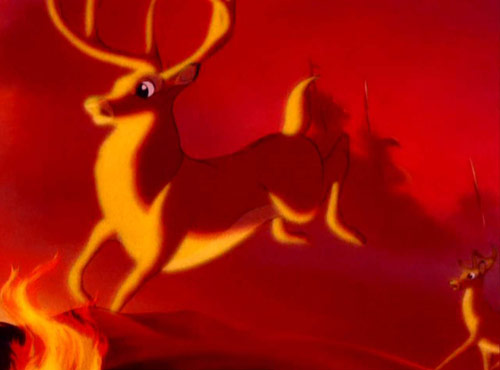
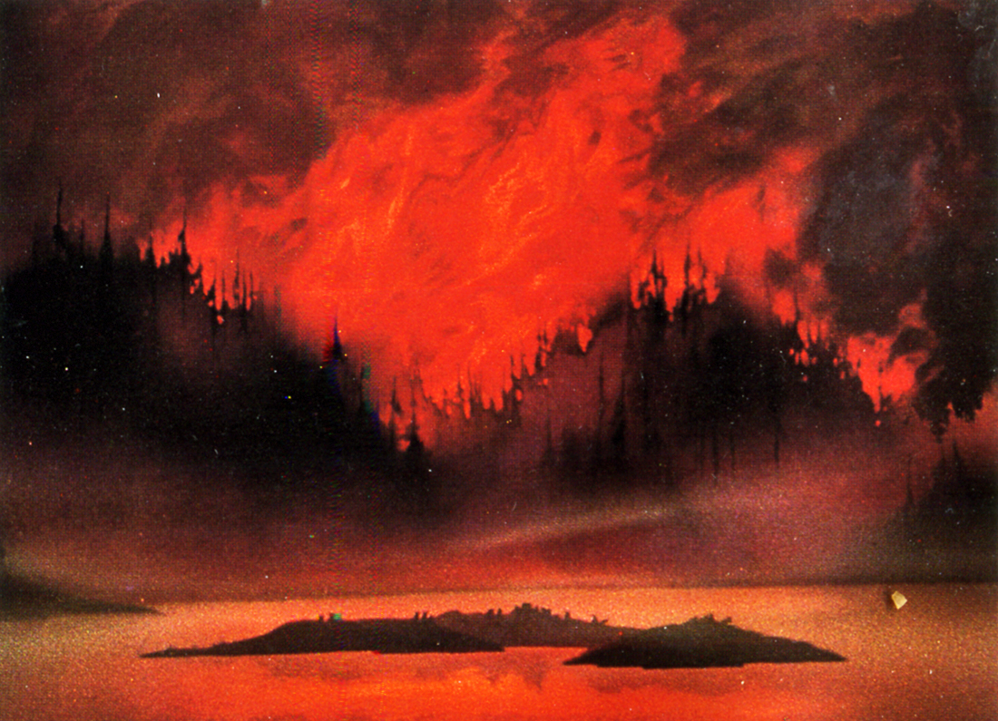
As the first lecture I was undergoing last Tuesday was about hues, warm, cool, harmonious and complimentary colours. I think it only fitting to do some research into various uses of these principles. These scenes below from Bambi to the Lion King greatly emphasise the uses of hues to capture the drama and intensity of what Disney is trying to emphasise to us. The first four use warm, well, I would define them as hot colours, the first and forth image seem to me to work in harmony, the first image too also has some red purple there which I noticed.
In scenes like the first one below from Bambi. This takes a different outlook from the above scenes where the colours depict intensity and drama. When I watched this scene for the first time, I found to me the colours gave a feeling of emptiness as there is nothing else in the scene but a faint tree and the two characters. Alongside that, the only intensity I can get from it would be that sense of unpredictability because the colours make the scene look empty and barren, there is that small feeling of "whats going to happen next?" To me these colours make a scene look unpredictable and curious to find out more.
In this scene from the Lion King, of course the death of Mufasa. From my analysis, the colour scheme on him is just clear enough to emphasise his status in the scene as our first subject of interest, the focal point. As it has been made clear that he is dead, the next subject would be Simba, the colours used on him are also bright enough to see. Everything in the background is deliberately tinted not only as a major rule to tint out all far away objects but to draw our attention to what is happening in the foreground, in front of us.
This drawing here which I had done as a test of general mood, is a night scene. When I was doing this drawing I thought quite thoroughly about what colours I wanted (warm/cool). In this case, as it was a night scene, I wanted to use cool colours for the general external objects (fence, grass, buildings) with the only warm colours used for the windows of the buildings.
With these two drawings here, drawn practically a month apart. The thought for which colours to use in this was for me more deeply considered than the first drawing shown at the start. I chose to use cool colours again in particularly the use of blue colours to depict the cold nature of the second drawing. There is also the complimentary orange colour for the electrical timetable alongside the contrasting red for the Underground symbol.
In this photograph taken from my holiday last year. In my view, there are cooler colours present in this photo due to the photos cold nature. Although, as there is some dim sunlight in the photo, it suggests despite the
general coldness, there are some vague warm colours in the slightly faint backdrop.
(Accessed 28th Nov 2011).
Between 3:54 and 4:12 of this part of the Akira movie I much admired the colours used in that particular scene showcasing the characters environment. As a bustling Neo Tokyo environment set out in the year I think its 2019 I much like the use of warm oranges, yellows, reds and some red purples alongside some calmer colours too.


.png)


No comments:
Post a Comment