
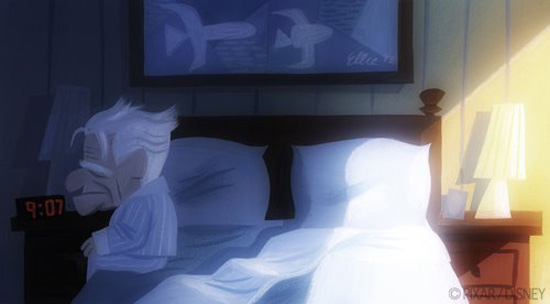
In this image, the balance in colour proportion would favor the darker blues and blacks that surround the characters in the scene. However, the characters are drawn into focus by the intensity of their colours rather than that of the background which has very dim colour apart from the torchlight playing some assistance in brightening up the scene.

The colour proportion here is greatly intensified by the fire here in Pixar's film UP. Of course in this scene, the villain sets fire to the old man's home, as the house is the old man's prided possession, the colour intensity is centered on that. The villain himself, is given his evil by the darker colour scheme to stamp his status and authority as the emotionless big bad that he is.
In this image, the only bright colour intensity in the image is that of the shining sun, but apart from that, the image in perfect relationship with the character himself and so its complimentary purple overshadows that little bit of light in the picture, as can be said with the image below.
. 


This concept painting above from Pixar's UP shows that in relation to colour proportion, the scenery in the backdrop is given more intensity in colour, thus drawing our eyes into seeing that first before the foreground and the characters in it. The background is given its intensity as it is representative of the old man's desire to reach this destination as he had set out to do.

This image above (The Newborn by Georges de la Tour) shows the woman in the red as the paintings main subject of focus. As she is embracing a newborn baby, it would seem natural that the woman embracing the child would be the subject of interest before the woman at the left hand side who is somewhat cast out by the dark surroundings in the background but kept in touch with the image via the little bit of bright light reflecting off the newborn baby, reflecting some hierarchy of focus in the image.

In this image of Frida Kahlo with her husband Diego Rivera, it would seem odd at first that Frida's colour choice doesn't fit in with the rest of the image, but why? In this image, the subject of attention is Frida herself with the bright red coloured item on her practically screams out at you. However, this image also shows a complimentary balance based off the intensity of the two hues. These two colours seem to clash together to prevent one from overshadowing the other. On the other side, Diego himself is cast out in very dull and broken blue grayish colours so as not to make him a subject of interest.

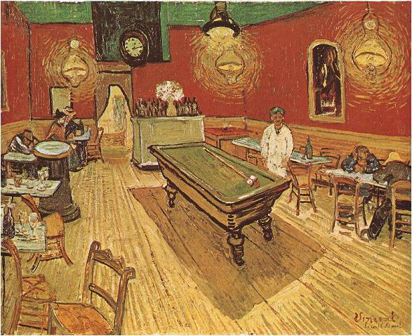
In these two paintings above and below, both by Vincent Van Gogh. The first image almost feels like one of the collages I posted up here earlier where the brightest hue, the yellow, doesn't stand out so much. However, in this painting above, despite its small presence in places, there is still some light, some life in an otherwise dark place. The painting below is a direct opposite to the painting above, indicating through its strong bold and bright colours that the proportion is very much all out intensity. The painting below indicates that there is life inside while it may be dark outside.
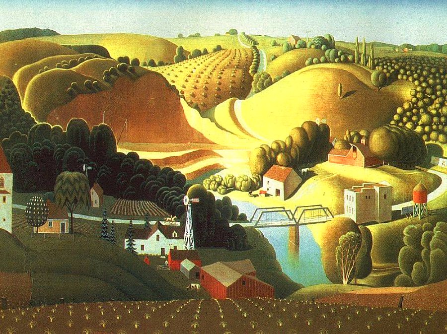
Stone city by Grant Wood in 1930 is a politically motivated painting revolving around the great depression in the United States in the 1930's. You could say it is an ironic painting because the colour scheme depicts a false reality of the impact the depression had on the American people. Here, he has used bright, warming and loving colours representative of happiness and great success to put his irony across.
No comments:
Post a Comment