Tuesday 3 January 2012

Colour narrative


In this concept art piece from the incredibles. To me, the colour scheme suggests a very broken atmosphere around the house because of the fact that our heroes now have to adapt to normal human living, thus cutting off their glory that was their superpowers. The colour scheme itself looks very broken and the sight of Mr Incredible outside on his own with the barbecue with his broken colour scheme only further emphasises his and their misery.    


This concept from the third installment of Toy Story (Toy Story 3 that is...) shows Woody and Buzz the protagonists in a colour scheme that consists of warming colours. For me looking in on this, the colours in this painting have been carefully considered to show the emotional relationship between the two toys.


These concepts above and below again from Toy Story 3 are for me ironic. The character of Lotso'huggin bear is an irony of an otherwise at this time nice warming atmospheric scene where warm harmonious hues have been put together to create a harmonious environment. He himself is designed to decieve the audience into thinking he is one with the scenery with his welcoming pinky purplish coloured fur. But even looking closely at him in the image below, the colour of his fur looks broken, is it the shadows involved in the scene, or something else? I make this statemen due to the fact that Lotso turns out to be the primary antagonist of the film. 


Again from Toy Story 3, this is to most the touching moment in The film when Andy reaches the age of maturity and goes to college, leaving his beloved Woody and Buzz and the remaining toys behind in the hands of a new owner. The colour choice adds a warm and harmonious feel on an otherwise emotional moment.


In this scene from Toy Story 2, the colour scheme used for the discovery of the abandoned toy Wheezy. The use of broken blue colours, some of which overlap onto Wheezy further show the dark nature of abandonment as Wheezy who was shelved after his squeaker was out of action found out.


In this concept from Toy Story 3, this scene shows several of Lotso's associates gathering in a dark area of the Sunnyside daycare centre gossiping in bad light about the newcoming toys (Andy's toys that is...). The broken yellowy greeny brown colours create a dark and evil atmosphere with the yellowy light revealing some of their faces.


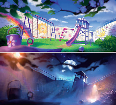
These two concepts of the Sunnyside daycare centre in Toy Story 3 show the centre in two different moods according in this case to the time of day. Of course, during the day with the children being dropped off by their parents the colour scheme is designed to look child friendly with bright colours and a warming welcoming atmosphere. However, at night, with Lotso and his minions in control, the day care centre becomes a torture camp, further emphasised by the dark blues and the spotlights with a colour scheme suited to intimidate escapee toys.


This scene relates to Lotso's upbringing by his former owner, who unwillingly abandoned him one night, unwillingly creating the path for his evil ways. Though Lotso wasn't always that way. This concept painting shows him in a good light with his former owner who from her position in this image, cherished him as her toy. Here, the colour scheme in the overall scene is somewhat broken, its warm, but broken in the sense as to not overshadow the subjects of interest, in which case are the two characters. 


Pablo Picasso's the tragedy uses a great range of broken blue hues to shed light on a dark situation. The characters are submerged in broken blues to show being frozen to the touch in numbness in response to this tragedy that Picasso is trying to convey here.


I see this quite often in anime wallpapers, often from looking on google and the occasional youtube video where people post up anime wallpapers here and there. This anime wallpaper has been composed in broken colours to mark a bleak situation for this character. She herself has been de-saturated in her colour scheme to fit into the scene while not losing her status of authority as the subject of attention.


This film poster from Tim Burton's Corpse Bride film shown above and below is a film entirely made of a broken colour scheme. However, this approach fitted in well with the film. From looking at Burton's gothic art style, this use of a broken colour palette is welcomed.  
Colour narrative part 2


The exercises in this post are about contrasting moods. The pairing I have chosen are happy and sad. In the happy section, I was rather choosy about my choice of colours but I managed to pick out the ones I felt would emphasise a mood within the scene. The bright yellows on this character walking through this space indicate that the mood of this character is happy and joyous and the atmosphere around them is reflective of this mood.

However. In this collage here, the mood is very different. As is most obvious, the colour scheme is different here. Here, I wanted to depict a sad mood in this piece and with my colour choices avaliable to me I had little trouble creating this sad mood. Using the purple and yellow combination together where I used one yellow with a little purple and the purple with a little bit of yellow. The colours with the white tint added was great for putting into the painting because they really make the composition look broken with colour.

Colour narrative part 1

For the colour narrative exercise I decided to reuse the colour palette of my broken de-saturated colours I created in my previous exercise on colour proportion.

Colour proportion


In this image, the balance in colour proportion would favor the darker blues and blacks that surround the characters in the scene. However, the characters are drawn into focus by the intensity of their colours rather than that of the background which has very dim colour apart from the torchlight playing some assistance in brightening up the scene.


The colour proportion here is greatly intensified by the fire here in Pixar's film UP. Of course in this scene, the villain sets fire to the old man's home, as the house is the old man's prided possession, the colour intensity is centered on that. The villain himself, is given his evil by the darker colour scheme to stamp his status and authority as the emotionless big bad that he is.


In this image, the only bright colour intensity in the image is that of the shining sun, but apart from that, the image in perfect relationship with the character himself and so its complimentary purple overshadows that little bit of light in the picture, as can be said with the image below. 
This concept painting above from Pixar's UP shows that in relation to colour proportion, the scenery in the backdrop is given more intensity in colour, thus drawing our eyes into seeing that first before the foreground and the characters in it. The background is given its intensity as it is representative of the old man's desire to reach this destination as he had set out to do.

This image above (The Newborn by Georges de la Tour) shows the woman in the red as the paintings main subject of focus. As she is embracing a newborn baby, it would seem natural that the woman embracing the child would be the subject of interest before the woman at the left hand side who is somewhat cast out by the dark surroundings in the background but kept in touch with the image via the little bit of bright light reflecting off the newborn baby, reflecting some hierarchy of focus in the image.

In this image of Frida Kahlo with her husband Diego Rivera, it would seem odd at first that Frida's colour choice doesn't fit in with the rest of the image, but why? In this image, the subject of attention is Frida herself with the bright red coloured item on her practically screams out at you. However, this image also shows a complimentary balance based off the intensity of the two hues. These two colours seem to clash together to prevent one from overshadowing the other. On the other side, Diego himself is cast out in very dull and broken blue grayish colours so as not to make him a subject of interest.  


In these two paintings above and below, both by Vincent Van Gogh. The first image almost feels like one of the collages I posted up here earlier where the brightest hue, the yellow, doesn't stand out so much. However,  in this painting above, despite its small presence in places, there is still some light, some life in an otherwise dark place. The painting below is a direct opposite to the painting above, indicating through its strong bold and bright colours that the proportion is very much all out intensity. The painting below indicates that there is life inside while it may be dark outside. 


Stone city by Grant Wood in 1930 is a politically motivated painting revolving around the great depression in the United States in the 1930's. You could say it is an ironic painting because the colour scheme depicts a false reality of the impact the depression had on the American people. Here, he has used bright, warming and loving colours representative of happiness and great success to put his irony across.

Colour proportion part 2

Making a particular hue stand out. 
In this case I chose a yellow hue. Its brightness would be the first subject of focus because of its brightness. The other hues involved are the complimentary hue and the colours in between.  Funny enough when mixed together, the purple and yellow seemed to mix together they seemed to form a blue colour which is what you notice here and in the following paintings.


In this one, I had to make that same bright hue stand out less. So I took out the yellow hue and made stand out less, but its just a small part of the piece, because of the small standout hue now makes way for new focal points i.e. the trees and the people walking through the environment.


This image is about the balance of the standout hue with the rest of the image. In this case, the standout yellow hue is now in balance with the rest of the image, therefore making the image as a whole stand out rather than one part grabbing all the attention.

Colour proportion part 1

First part of the colour theory exercise on colour proportion. In this exercise, my task was to select a pair of complimetary colours and produce a range of 5 broken de-saturated colours by mixing the two complimentary colours. The second part was to repaint the complimentary colours add a white tint to the colours.

Sunday 11 December 2011

Colour theory: Saturation part 2

Using the colours I created beforehand, I then started making collages out of them in Photoshop. This was just purely being loose and free with what I was creating. I really tried not to think too much about a paticular composition. I very much just threw things together really.