Using the colours I created beforehand, I then started making collages out of them in Photoshop. This was just purely being loose and free with what I was creating. I really tried not to think too much about a paticular composition. I very much just threw things together really.
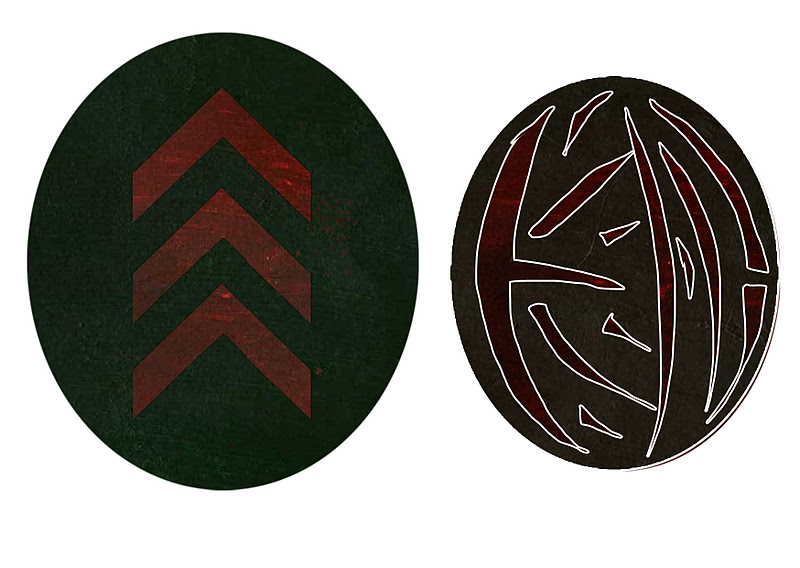
In todays lecture, the subject of interest today was saturation. Saturation describes the purity and intensity of a colour. The first part of the lecture was to make a colour palette from the pure hue down to the grey of the saturation. In my case I decided to go with two complimentary colours, red and green.
Before I was able to get to know the term in colour theory called value. I had originally associated it with only black and white, that was until I discovered the art of Feng Zhu. Watching his videos via http://www.youtube.com/user/FZDSCHOOL?feature=watch I found his teaching very helpful in understanding the use of values and also about general compostion that is, in my case, making the foreground darker and any objects in the background lighter or faint.
In the blue coloured piece by Craig Mullins. I much like the choice of colour here in the blue, the blue shade (dark blue) is made even more striking by its use of a slightly darker blue to show the many caves situated within these rocks, the tinted blue in the backdrop for me adds to the interest of whats likely happening in the backdrop.
The image here from Makoto Shinkai's 5 centimetres per second shows good uses of colour value to present the desired mood to us, in this case a winter setting with snowfall. Almost all but for the building windows and in some small part the characters themselves are covered in a blue colour with light blue tints and dark blue shadows.
In the two drawings above, both my own and previously used in the Hues lecture blog, also shows some value, in terms of the various blue colours there, although in the buildings themselves show a darker shade of blue. The objects situated in the backdrop take on a lighter tint of blue as they get further away.
In todays lecture. I was learning about Value. Also known as tones, values refer to brightness and darkness of a colour. i.e. Blue, dark blue, light blue. In red however, it is the only colour to have its darker and lighter shades with different names, pink and maroon.
The two images above are from the lecture exercise where the objective was first, to place the values in order i.e. from tint to shade or vice versa. The exercise below that one involved me having to place my colours but with the tints being more dominant than the shadows. The image below is the vice versa of the tint exercise. This one is now the shadows being more dominant.
When I created my piece. I originally wanted to choose blue and orange. I think personally they are my favorite complimentary colour pair.